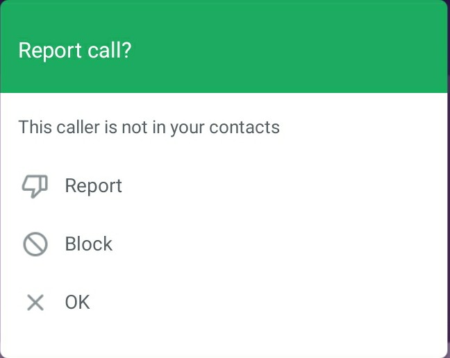
This is a popup that appears after an unknown number calls you on WhatsApp. I think the icons and the label for “Report” and “OK” do not match.
Better still, using a clear label such as “Do not Report” or “Cancel” would be ideal in this case instead of “OK”.